Back to Contents Page
Practical Notes
Contents
Clear Water-soluble Gutta
Clear water-soluble gutta is best applied from a small plastic squeezy bottle
fitted with either a 0.5mm or 0.3mm gutta nib. If you only have tubes of gutta,
the gutta can be squeezed out into a bottle fitted with a nib.
If you find that your water-based gutta is too thick and blocks the nib or produces a blobby
line it can be carefully diluted with water stirred in a few drops at a time
until it produces a smooth line from the nib. Dont thin it too much or it will
spread out onto the silk when applied.
Never fill a plastic gutta bottle more than a quarter full. This will give you more control and help you
to draw fine even lines without blobs. Always tap the upturned bottle before use to remove
air bubbles and test the flow of gutta a piece of paper.
Use a hairdryer to speed the drying of water-based gutta.
When storing water-based gutta in a plastic bottle never leave a steel pin in the nib to keep it clear.
The pin will rust and contaminate the gutta. Use a piece of fuse wire with a loop in the end.
Fasten a tag to the loop so that you can easily find it again when you take it
out of the nib and put it down on your work surface.
Clear water based gutta is soluble in water therefore you should always be careful when wetting silk
prior to painting wet into damp where you have dry gutta lines on the silk. If
these gutta lines get too wet they will dissolve and lose their resistance
property. However used in a controlled fashion water can be used to remove
unwanted or temporary gutta lines.
Unwanted gutta lines
can be removed if necessary by repeatedly wetting the gutta and dabbing it
off the wet silk with a paper tissue. Take care not to rub the silk because you may also
remove partially fixed paint. Finally dry the silk with a hairdryer and continue
with the painting process.
|
|
Temporary gutta lines
were used in my painting Foxgloves to create the shadow on the white
blotches under the upper lip of the flowers.
On each flower the white patches were the first part to be outlined with gutta. A sequence of gutta
lines and layered silk paint was applied to create the shapes and colours of each flower. Then several
applications of clean water mopped up with tissues were used to dissolve the
temporary gutta lines from the shadow area. The gutta outline of the lip was
checked and reapplied if necessary and the shading painted wet into damp. This
process was repeated for each flower with blotches.
|
Back to Top
"Hidden" Gutta Lines
Most of my silk paintings use the following technique that
hides the resist lines so that in the finished painting adjacent areas of colour are not
separated by a white line left when the resist is removed. It is called sequential gutta work
with layered painting and I explain the technique in more detail in my booklet
Silk Painting using "Hidden" Gutta Lines.
I have found that the best results are obtained using iron-fixed silk
paints. When a layer of paint is dried with a hair dryer it is fixed and will not run when the
next layer of paint is applied. Iron-fixed paints are also slightly opaque which helps
hide
the under-painting.
|
|
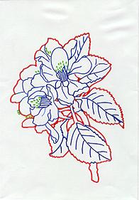
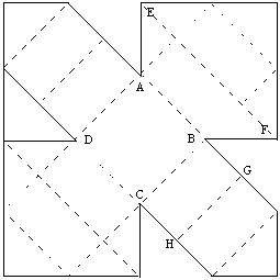
1. I drew my chosen design on a sheet of paper the same size as my silk
painting frame. I planned a sequence of gutta lines so that as far
as possible I would only paint to one side of each gutta line
unless I wanted the line to be seen as part of the design.
I colour coded the lines on the drawing to remind me of the sequence
that I had worked out. I fastened the finished drawing onto the back of the
frame so that it did not touch the silk and with the aid of a
light placed beneath the drawing I was able to trace the lines.
|
|
|
2. Because this design has a white background,
the outlines (shown in red on the drawing) were the first resist lines
I drew on the silk with clear gutta.
Next I drew in the anthers (shown in green on the drawing) with
gold metallic gutta.
|
|
|
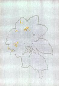
3. I created the desired pale pink by mixing my colours with water.
I dampened the silk and painted wet into wet to soften the edges of the painted areas. I
painted the petals but most importantly I also allowed the colour to flow beyond the petal
shapes.
Next I drew the outlines of the petals in clear gutta on top of the
pale pink.
|
|
|
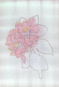
4. I started to shade the petals deeper pink and paint the leaves a pale green.
Next I drew the veins of the leaves in clear gutta on top of the
pale green.
As I added darker shades of green the underlying pink was hidden so
that in the finished
painting the pink and green areas are not separated by a white gutta line.
|
|
|
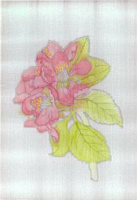
5. I continued to add shading and shadows to the petals and leaves
and painted the stem to complete the painting.
Then I removed the silk from the frame and ironed on the reverse with
a warm iron for two minutes to fix the paints.
I washed the silk in lukewarm water to remove the clear gutta.
Then I rolled the silk in a towel to remove
most of the water and ironed the damp silk to remove all creases.
|
Back to Top
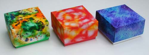
Making Silk Covered Boxes
Introduction
Squares
of silk painted with silk paints or dyes can be used to cover the lids of gift
boxes made from thin white card. Sections of unsuccessful silk paintings can
also be used.
To
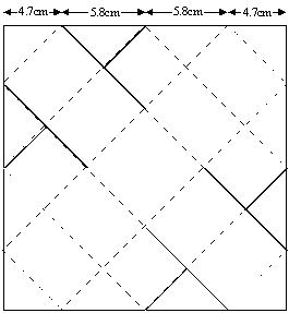
make the boxes shown above with lids 7cm square by 3.5cm deep, use a 30cm square
of silk stretched and pinned to a frame made from four 28cm lengths of softwood.
Paint
the silk using the effects of your choice taking into account the following
points:
1. The centre of the silk will be on top of the lid and therefore needs to
incorporate the best part of the pattern. If particular shapes are used in the
design make them small enough to fit onto the outside or the top of the lid.
2. The trimmed edges of the silk are folded inside the lid and cannot be seen when
the box is closed but because the pattern continues on the inside it can impart
a wonderful surprise when the lid is taken off. You can allow for this fact when
creating your design.
The
choice of colours plays an important part in producing a pleasing effect.
Remember when using silk paints to start painting with light tones before adding
darker tones.
Once
the painting is finished and the silk is dry take it off the frame and fix the
colours. Follow the manufacturers instructions on the silk paints.
Pin
the silk back on the frame and follow the box-making instructions.
If you
are using iron fixed paints and are able to iron the silk whilst it is still
pinned to the frame there is no need to remove it.
Use
a 20cm square of thin white card (approximately 350mic) for the lid and a 21cm
square of thin plain, coloured or metallic card (approximately 350mic) for the
box base.
You
will also need a roll of 25mm wide double-sided tape to stick the silk to the
card and to assemble the lid and base of the box.
A
thin square of padding can be attached to the centre square of the card before
the silk is attached. This will make the top of the box feel soft and silky to
the touch.
Larger
sized boxes can be made by increasing all the original measurements by the same
amount. Shallower boxes can be made from the original sized cards by altering
the measurements so that the top of the box becomes bigger.
For
example use (7cm, 3cm, 3cm, 7cm) instead of the original (5cm, 5cm, 5cm, 5cm)
measurements. The base dimensions will also need to be altered in the same way.
|
|
|
|
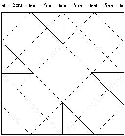
The Box Top Figure 1
|
Figure 2
|
Making the Box
1.
Make the lid that is to be covered with silk from a 20cm square of white card.
Mark points along each side 5cm apart. Join these points as shown in the diagram
figure 1.
2.
Cut along the 8 solid dark lines and score along all the other lines. Fold each line
and open out flat again.
3. Stick four strips of 25mm wide
double-sided tape from corner to corner along the outer edges as shown in figure
2.
4.
Cut the tape as shown (a), fold the loose end behind and stick it to the back of
the card (b).
5.
Repeat on the other three sides.
6.
Peel off the tape backing and stick the card onto the back of your painted silk
whilst it is still pinned to the frame.
7.
Take the silk off the frame and trim it back to the 20cm square. (Do not cut out
the triangular areas of silk not backed with card.)
8.
Stick two strips of double-sided tape in the centre square on the reverse of the
card (c).
9.
Fold the card along the crease line A-B and stick down two of the triangular
areas of silk onto the tape. Fold the card along the crease line C-D and stick
down the other two triangular areas of silk. Make sure the silk is pulled tight,
as you stick it down. The card will be partially folded. Do not try to flatten
it out again.
10.
Follow the folding instructions figure 3.
|
|
|
|
Figure 3
|
The Box Base Figure 4
|
11.
When the triangular areas of silk were stuck down, lines A-B and C-D were folded
with the silk on the outside of the fold.
12.
Now fold line E-F (again with the silk on the outside of the fold). The two side
flaps E and F will be pulled inwards.
13.
Fold the opposite corner of the card in the same way so that the opposite
corners meet in the centre. The side flaps will also be folded.
14.
Now carefully peel off the backing from the two strips of tape in the centre
square.
15.
Stick the two opposite corners down so that they meet inside the lid at the
centre of the square.
16.
Fold lines B-C and D-A to form the other sides of the box.
17.
Now fold line G-H over the side flaps and stick the corner of the card down so
that it meets the other two at the centre.
18.
Fold the last side of the box over the side flaps and stick the last corner of
the card in place.
19.
Make the base from a 21cm square of card (plain, coloured or metallic). Use the
measurements shown in figure 4. Cut along the solid lines and fold in the same
way as the lid and fit a square of card inside the box to hide the base joins.
Back to Top
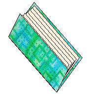
Making a Silk Covered Booklet
1.
Paint a piece of silk with the decorative effect of your choice to cover the
booklet. You can make booklets of any size but to cover a booklet made from
folded A5 sheets of paper use a 30cm square of silk. If you have used iron-fixed
silk paints fix the paint by ironing the wrong side of the silk whilst it is
still attached to the frame. If you have used the salt effect you will have to
take the silk off the frame to fix it and then wash the silk to remove any
remaining dissolved salt. Re-attach the dried silk to the frame.
2.
Cut a 16cm x 22cm piece of white card 350mic thickness for the cover. This size
is slightly larger than the folded pages so that they will not protrude when
they are attached inside the cover.
3.
Place the card on the wrong side of the silk and using strips of 2.5cm wide
double-sided adhesive tape, attach the card to the silk. The strips of tape
should be stuck down half their width on the card and half on the silk as shown
in figure 1. Do not remove the tape backing strips at this stage.
4.
If you place the card near the bottom of the frame you will have a strip of
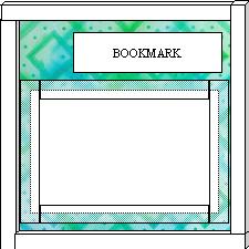
painted silk left over for another project like a silk covered bookmark.
5.
Take the silk off the frame and with a sharp pair of scissors trim the silk to
the outer edge of the double-sided tape.
6. Mitre the corners to within 3mm of the card as shown in Figure 2.
|
|
|
|
|
Figure 1
|
Figure 2
|
Figure 3 |
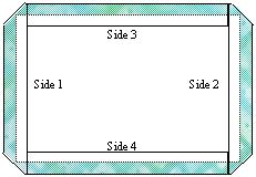
7.
Peel the backing strip from the tape on side 1 and carefully fold the silk up
and over, and stick it down. Peel off the backing strips and stick each of the
remaining sides down in order, 2, 3 and 4.
8.
Here is an effective way to make sure there are no air pockets when you stick
down the edges. Place the silk covered card on a work surface with the card
uppermost and side 1 towards you. Remove the backing strip from side 1. Grip the
card near each end of side 1 and slide the card away from you. Let side 2 lift
and turn towards you making
sure you keep the card edge of side 1 in contact with the work surface as you
slide it.
9.
Continue sliding away and turning over the card until it is flat on the work
surface with the silk uppermost. Turn the card back over and smooth down the
edge at side 1. Repeat the process with each remaining side in turn. Trim any
excess silk from the corners.
10.
Measure and draw in the centre line where the card is to be folded. Score the
line and fold. Now the cover is ready for its contents.
11.
Make up a sewn booklet using 6 sheets of A5 paper. You can cut A4 sheets
in half to make A5.
12.
Fold each sheet in half giving it a crisp crease.
13.
Assemble the folded sheets into a booklet.
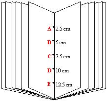
14.
Pierce 5 holes along the fold line, 2.5cm, 5cm, 7.5cm, 10cm and 12.5cm from the
end of the fold as shown in figure 3.
15.
Use 30cm of strong thread to sew the booklet.
Start
by passing your threaded needle from the back of the booklet through the centre
hole
C.
Then through hole B
, hole
A and back in the opposite direction through hole
B,
Now down to hole D
, hole E
and back through hole D in the opposite direction. Finally pass the threaded
needle back through hole C.
Make sure that the two ends of the thread pass either side of the loop from
B
to D.
Pull
the thread tight and tie a double knot, trapping loop B
to D
under the knot. Snip the ends leaving 2cm of thread.
16.
You can also fold the A5 sheets long ways to make a tall booklet. The 5
threading holes are A
3.5cm, B
7cm, C
10.5cm, D
14cm and E
17.5cm. Use 40cm of thread to sew a tall booklet.
17.
You can attach the pages in two ways.
a.
When the pages are pierced and sewn together include the cover and sew the pages
into it. Start the sewing from the inside so that the knot is not tied on the
spine of the booklet.
b.
Sew the pages as explained above with the knot on the spine and fix the sewn
pages into the cover. You can use glue or double sided tape to fix the front and
back pages to the cover. With this method the knot is neatly hidden.
With
either method make sure the centre folds of the pages and the cover are in line
and that the top and bottom margins are equal when you assemble the booklet.
18.
If you want to use the excess silk for a bookmark, cut a strip of card 5cm x
18cm. Stick strips of double-sided adhesive tape long ways on the back of the
card to cover it completely. Peel off the backing strips and stick the bookmark
down onto the decorated silk at the same time as you attach the card for the
booklet cover. Trim the silk to the edge of the card.
Back to Top
Some Aspects of Design
An
Article I wrote for the Journal of the Guild of Silk Painters
|
Flower paintings are often be dismissed as commonplace therefore I want my silk paintings of flowers
to be special and entertain the spectator. The design is the most important and
in some ways the most difficult part of the process. Consequently I always
spend a considerable time working it out.
I take lots of photographs and I make sketches. Photographs provide a
good record of colour but observational sketches are invaluable in recording shape
and form.
Sometimes the elements of design come together naturally to produce a
composition that is interesting and aesthetically pleasing to the eye. At other
times I find it useful to employ certain design principles to realize the
latent potential of the visual resources I have brought together.
For me the essential aspect of any design is unity
of composition. All the sections should be related in some way. This is often
achieved by using related lines and shapes. Although my silk painting
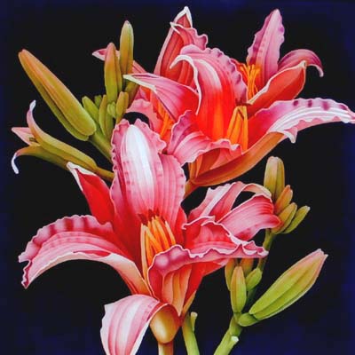
Daylilies illustrates several design principles, when I looked at my initial
sketches I decided to develop what I considered to be the dominant feature, the
related smooth curving lines, shapes and texture of the petals, to give unity
to the design. I placed the flower heads close together so that they overlapped
giving extra depth to the composition.
Balance is another very important element. It brings stability to a design and can be symmetrical or
asymmetrical. I usually use an asymmetrical balance because of its informality.
Small shapes placed further out near the edge balance large shapes placed near
the centre of the picture. Although the composition is balanced it appears
active and dynamic.
Repetition and alternation
(what occurs between the repeats) also give life to a design. My silk painting
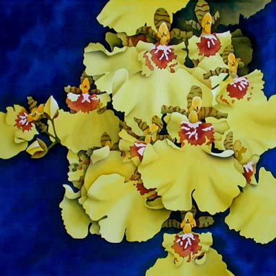
Dancing Ladies Orchid illustrates these last three aspects. Asymmetry plus
repetition with variety creates an exciting visual rhythm. My silk painting
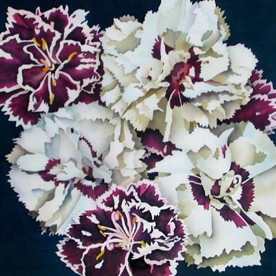
Pinks has repeated and alternated shapes and colours, asymmetrically counterbalanced.
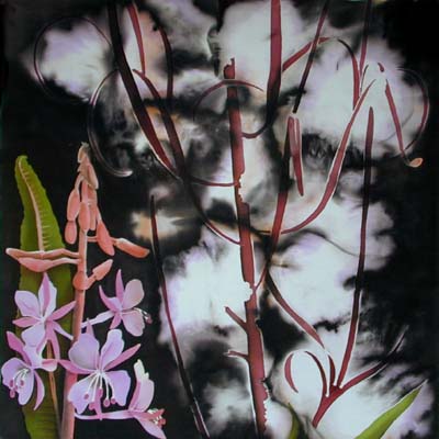
My silk painting Fireweed shows how a picture can be brought to life by introducing
conflict into the design. This conflict is between juxtaposed versions of the design
elements, straight lines against curved; lightness against darkness; hard edges
against soft, curved shapes against angular and large objects against small.
The introduction of conflict risks destroying the unity of a design but by
making one element dominant the conflict is resolved, balance is restored and
unity regained. In this example the flower spike of the Rosebay Willowherb
restores balance to the design.
The mood of a painting can be accentuated by the use of harmony and gradation of
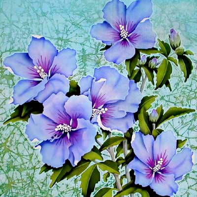
colour and texture. In my silk painting Hibiscus - Bluebird a tranquil mood is created by the use
of a harmonious gradation of colours and a soft gradation
of background texture.
In each of these examples I have singled out certain aspects of design that are to a
greater or lesser degree common to them all. We may not knowingly employ design
principles in our work but when a painting is not successful it is usually down
to poor design however skilfully it is painted. When we produce a successful
design it is useful to use these principles to analyse the painting. By doing
so we become more aware of the importance of good design.
Back to Top
|
|
|
|
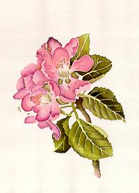
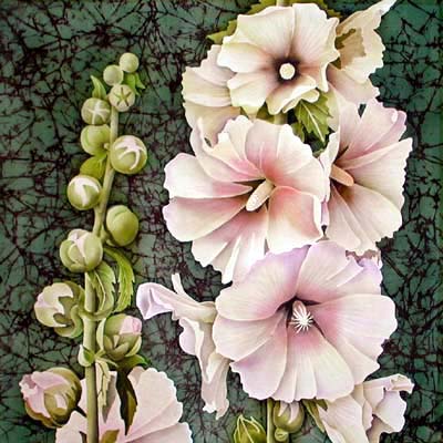
Daylilies
|
|
|
|
Dancing Ladies Orchid
|
|
|
|
Pinks
|
|
|
|
Fireweed
|
|
|
|
Hibiscus Bluebird
|
Backgrounds
An
Article I wrote for the Journal of the Guild of Silk Painters
One of the questions I
am frequently asked is how to deal with backgrounds. Many painters are often
unsure of the type of background to use to complete a painting. Although the
objects in the painting really matter, all the elements, including the
background, should work together. This means considering how you will treat
the background when planning your painting.
The problem is neatly
solved if your design is such that it leaves no background visible. By
zooming in very close and cropping the subject it can be made to fill the
painting area.
|
|
|
|
|
|
|
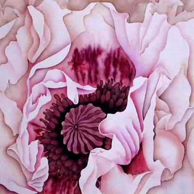
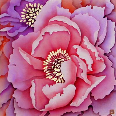
There
is little or no background in these two examples. |
|
Too much salt?
|
However
most designs require a background so here are a few ideas you may find
helpful.
A plain
background shows up the shape and form of the subject but do not paint it
flat. Keep the background colours in tune with the overall colour scheme of
the painting and try to employ several of the colours and tones used for the
subject. This will help to tie all the elements of the picture together.
Adding
texture to a background gives it depth, movement and drama. There are
several ways to do this. One of the simplest is the salt technique but be
careful how much salt you use. Too much and the effect, although attractive,
can over power the objects in the foreground. Another texturing technique is
to use brush strokes. Paint onto damp silk and let the colours blend to give
a mottled effect. Brush strokes can produce a random or directional effect.
A more sophisticated technique is to use a batik wax crackle. This can also
be random or directional. If the texture is directional, think carefully how
this links with the objects in the foreground. If the objects themselves are
highly patterned or textured beware of adding too much texture to the
background.
|
|
|
|
|
|
|
Mottled brush strokes |
|
Random
batik wax crackle
|
|
Directional wax crackle
|
Gutta lines
can also be used to add textural effects to the background. Paint the
background base colours and any shadows. Draw and shade the gutta lines one
at a time, starting from the direction of light source. Draw the lines
freehand on the silk or plan them on your working drawing. Vary the distance
between the lines to give a naturalistic effect.
The choice
of viewpoint can influence the background. If you choose a low viewpoint
then the background can be a graded wash to represent the sky. An
interesting background can be introduced if the viewpoint is above the
subject.
|
|
|
|
|
|
|
Shaded gutta lines |
|
A low viewpoint
|
|
Viewpoint above the subject
|
If when
painting a background you find it difficult to paint a large area of silk
without getting unsightly brush marks then divide it into sections by
bringing parts of your design to touch the edges of your painting. The
resulting smaller areas can be painted and dried one at a time.
Using the
hidden gutta line technique it is essential to plan before you start
painting whether the background will be lighter or darker than the subject
of the painting. A light background must be painted before the subject
whereas a dark background will be the last area of the silk to be painted.
Once made I
usually find it is best to stick to my initial plan. However there are no
binding rules. Sometimes my planned scheme does not work out and a
better solution for dealing with the background can be found. Always be
prepared to experiment and try out new ideas. Experiment with unusual colour
combinations, patterned drapes and decorative objects.
|
|
|
|
|
|
|
Experimental choice of colour |
|
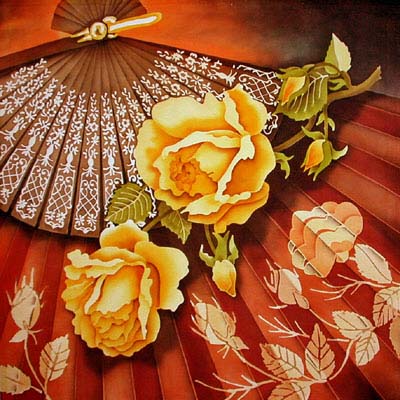
Brightly patterned drapes
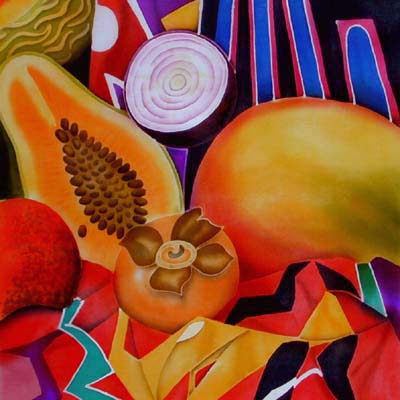
|
|
The folds of a decorated fan
|
Back to Top
How to Make a Simple Stand
|
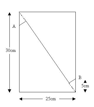
This stand was made from a 25cm x 30cm piece of thin hardboard, but smaller stands to
display greetings cards could be made from strong cardboard.
|
|
1. Draw a diagonal line on the board.
2. Then from points A and B (5cm from the opposite corners)
draw lines at right angles to the diagonal (as shown on the diagram).
3. Use a craft knife and
a steel rule to cut along the three straight lines from A to B.
|
|
|
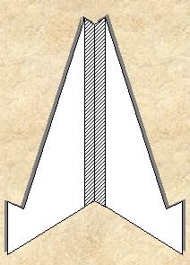
4. This makes two identical shapes
that are joined along their longest edges with strong fabric adhesive tape to form a hinge.
It makes a perfect picture stand. Not only can it be stored flat but by adjusting the inside
angle, pictures of both landscape and portrait formats can be displayed.
|
 |
Back to Top
E-mail Address
Contents Page
Copyright ©2000 Leonard Thompson
Last revised: September 26, 2010